SerenArt Architecture
For SerenArt Architecture, I created a brand identity that mirrors the architect’s calming, balanced, and meticulous approach to design. The color palette leans towards soft pastels, reflecting her harmonious aesthetic and approachable nature.
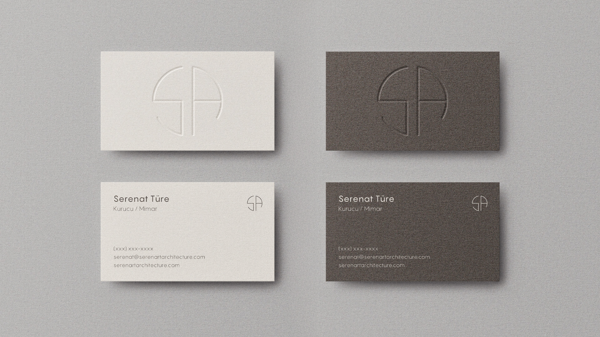
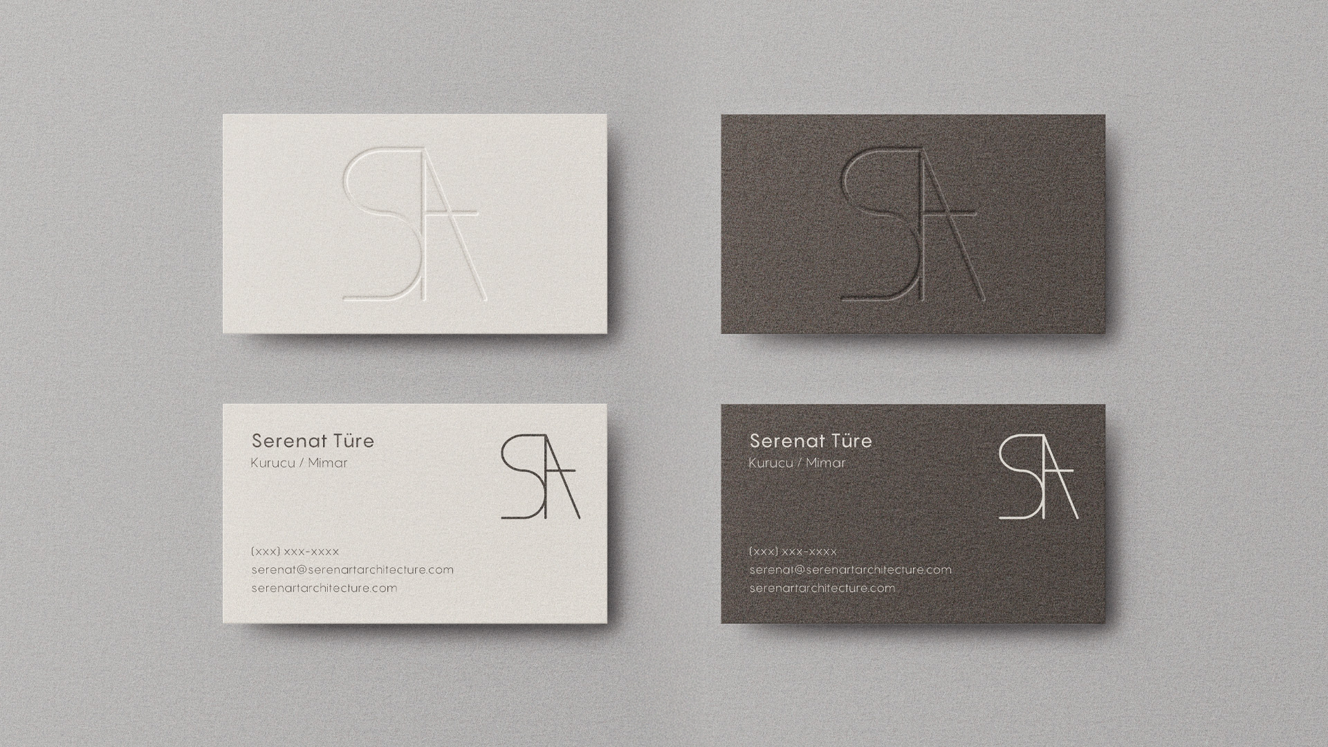
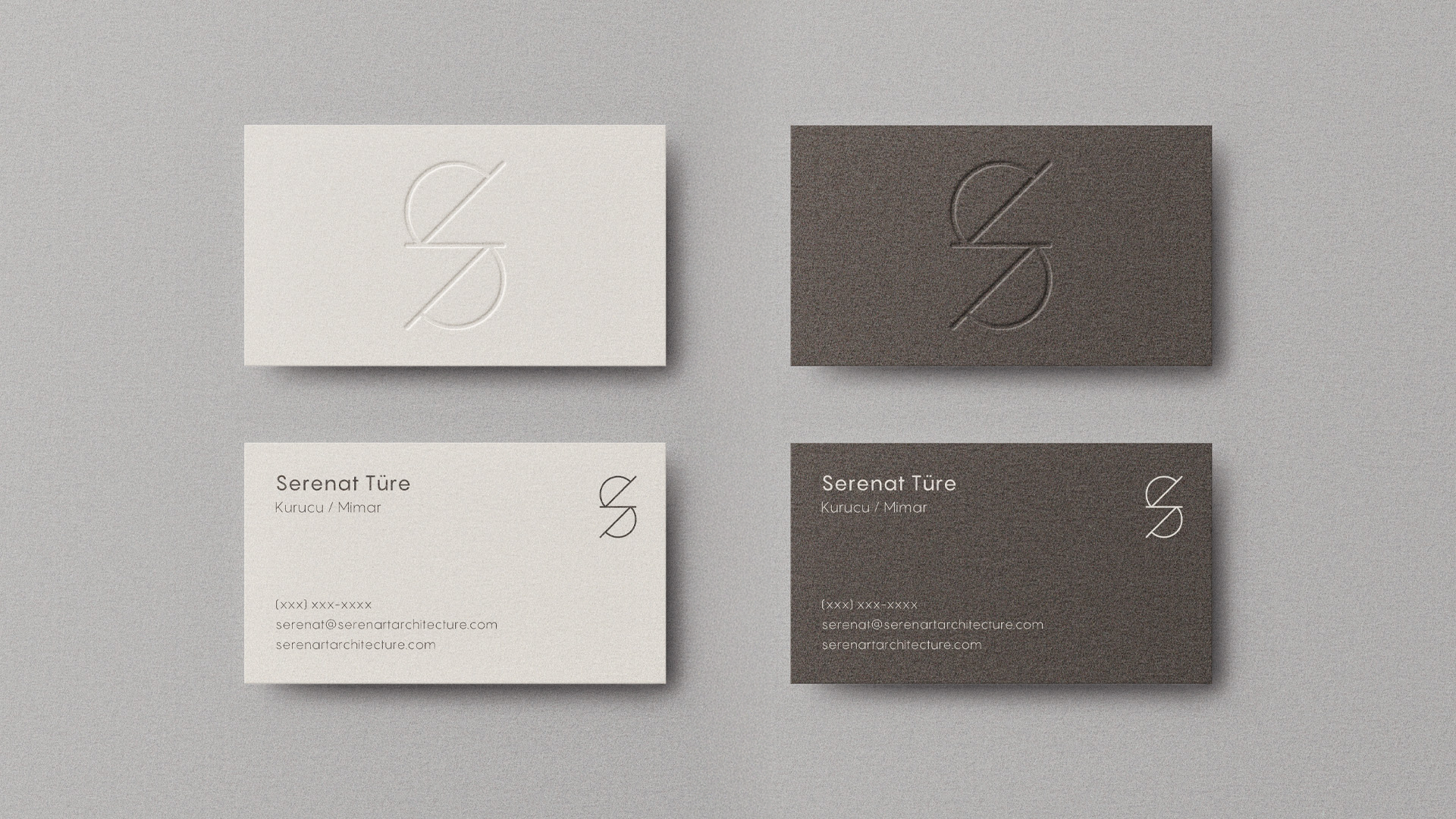
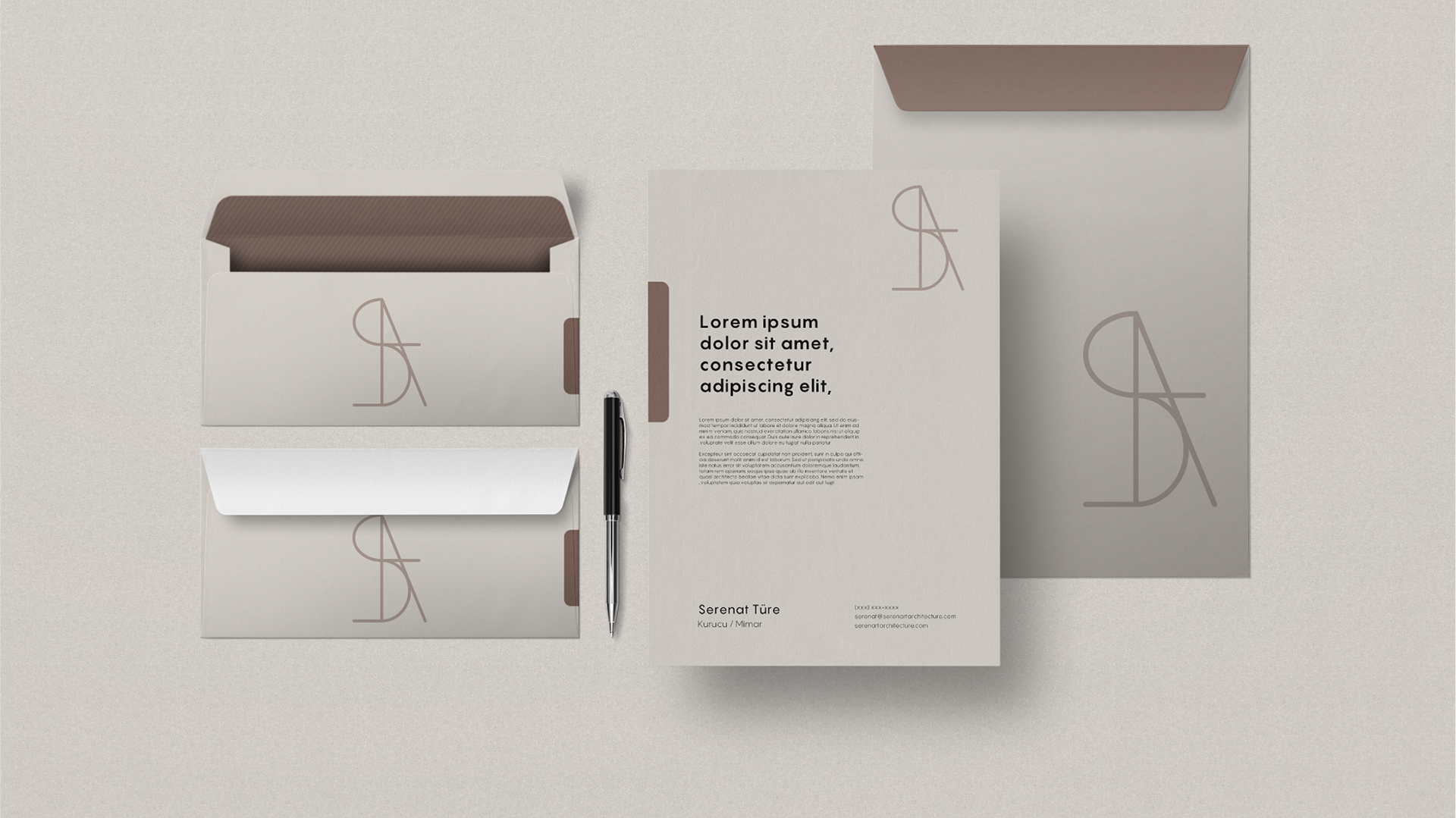
The logo is symmetrical and inspired by architectural shapes and orders, symbolizing precision and structure while maintaining a sense of elegance. This extends to the stationery, which includes letterheads, business cards, and other branded materials, embodying the same clean and refined aesthetic.


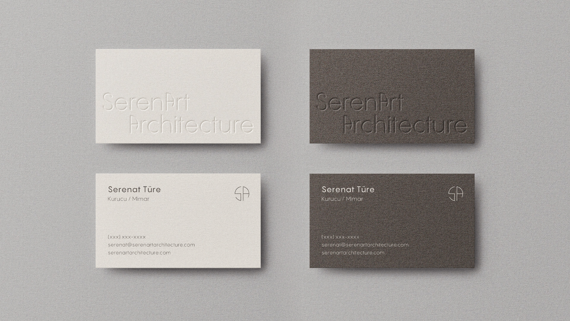
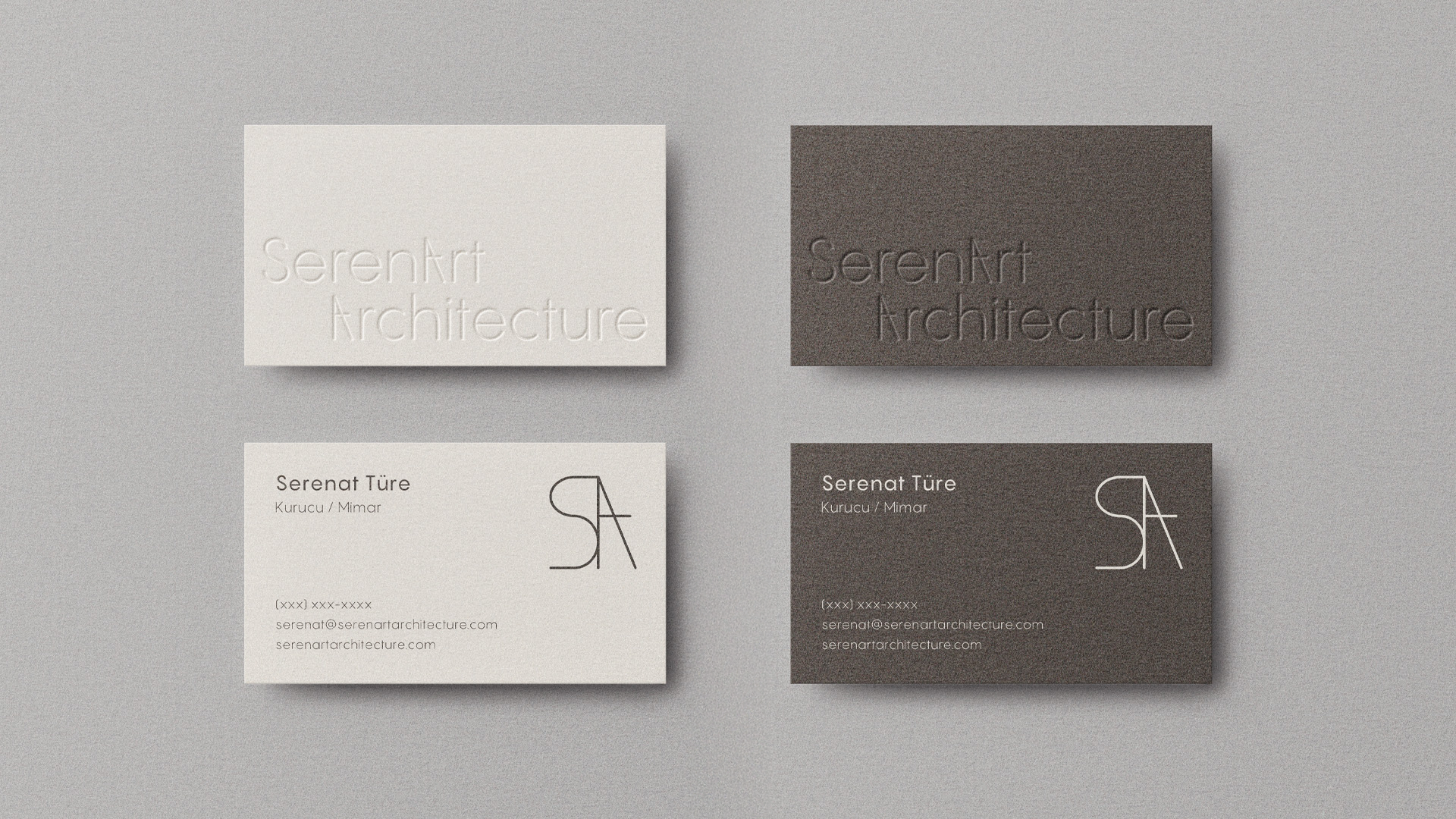
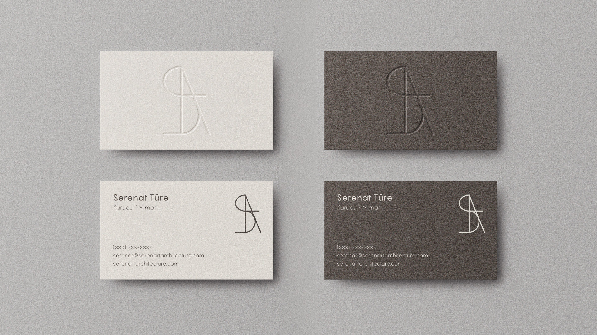
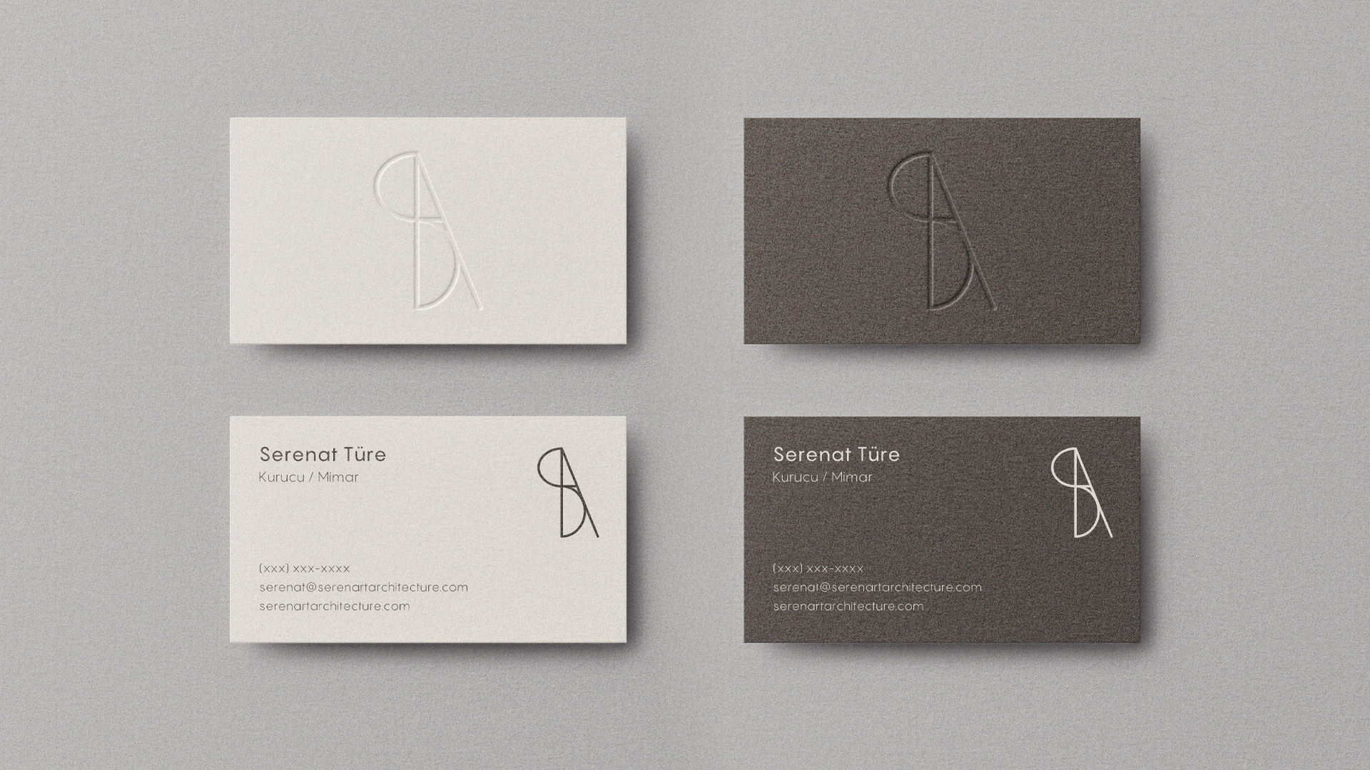
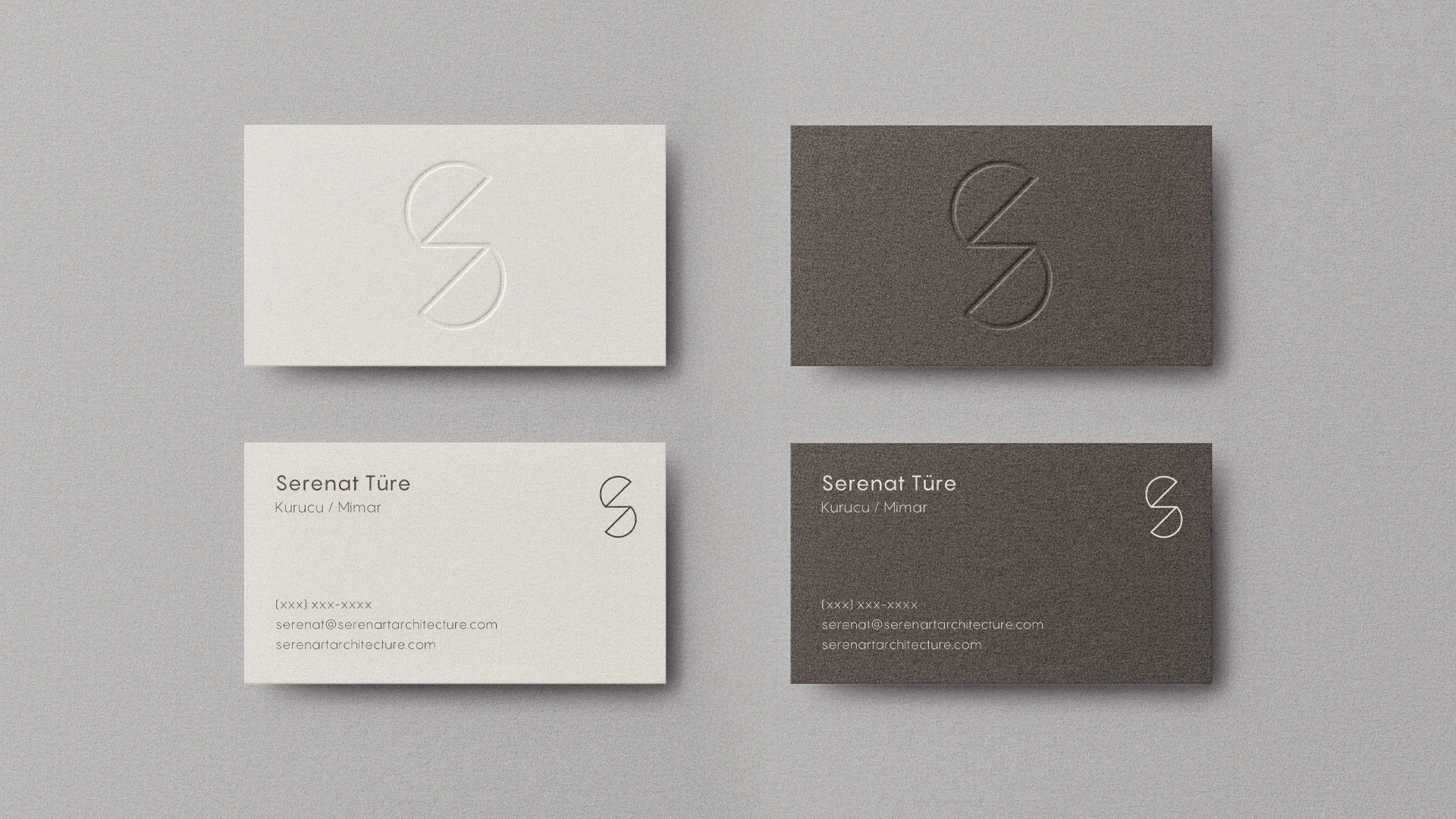
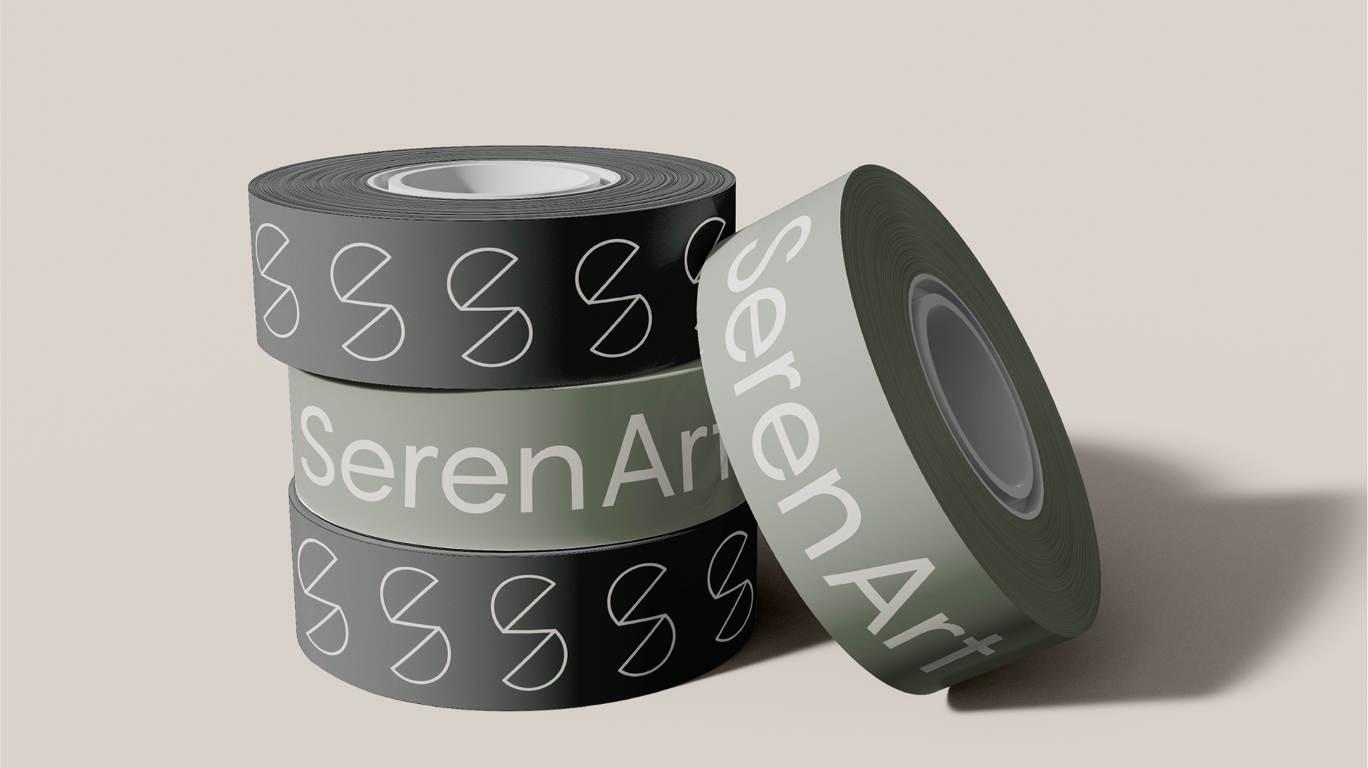
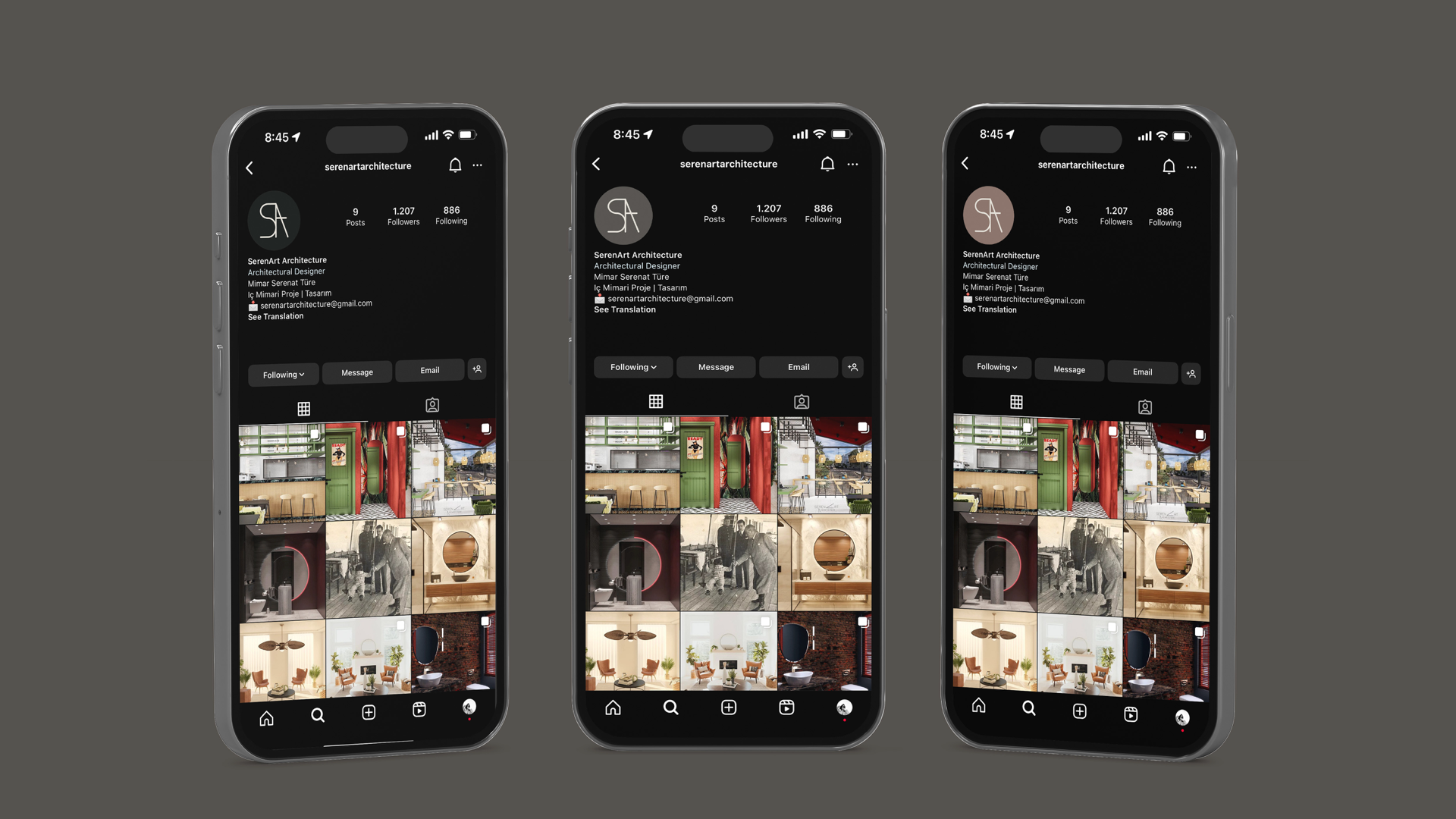
Social media assets and brand lettering were crafted to emphasize her detail-oriented and friendly personality, seamlessly blending professionalism with warmth. Through these designs, SerenArt Architecture’s approachable yet meticulous ethos is visually captured, reinforcing the trust and satisfaction her clients consistently express.

